Advanced Chart Configuration
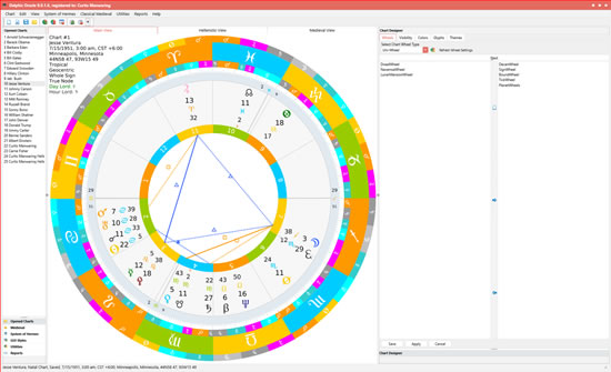
Practically all aspects of the Main Chart display (and other views) are configurable in the Chart Designer. The main setting areas are broken up into four groups: Wheel settings, Visibility settings, Color settings and Glyph settings. The Wheel Settings are handled by the Wheel Wizard which allows you to set which wheels you want to be shown, their order from outside to inside, and their thicknesses. One selects the wheel type (uniwheel, biwheel, triwheel, quadwheel and quintwheel) and the settings for that chart display type are loaded and then can be modified or canceled. (shown below right)...
The wheels can be moved between left (unselected) to right (selected) and then ordered from outermost (top) to innermost (bottom) by selecting and dragging that wheel up or down in the right side list. Then clicking next brings up the wheel dimensions (thicknesses):
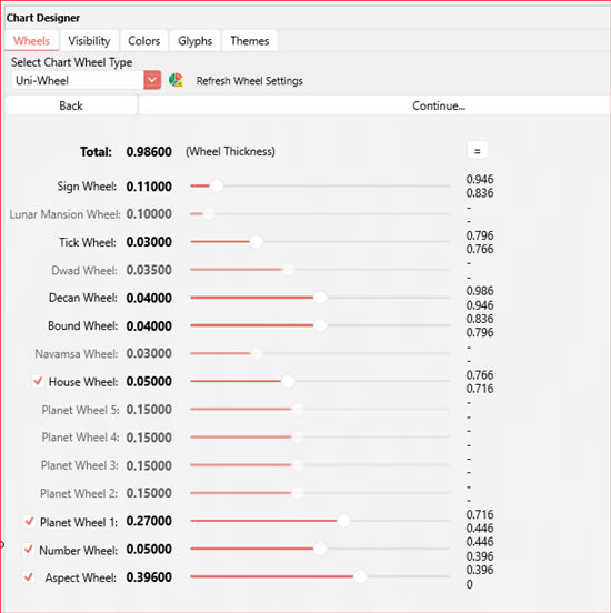
The main thing to keep in mind here is the total which cannot exceed 1.0 shown at top left. As you make some wheels thicker, you have to make some wheels smaller and this is done by dragging the trackbars for each wheel either left or right. You can optionally hide some wheels (such as PlanetWheel1) as shown by the checkboxes on the left being unchecked which enables special tricks to be employed (in the case of showing fixed stars in the sign wheel one might also want to display planets in the sign wheel as well, which would make PlanetWheel1 redundant).
Clicking Continue brings up the last tab which has 4 configuration sub tabs to apply finishing touches. These different options are explained by hints which show in the memo field when you click on an item and comprise a total of about 70 different possible display configuration options.
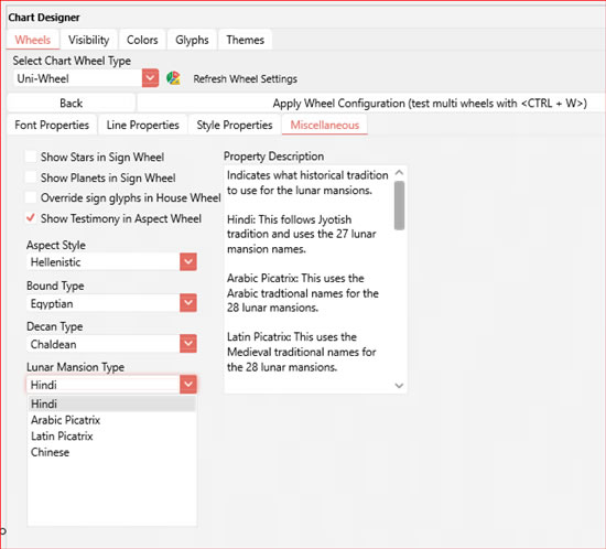
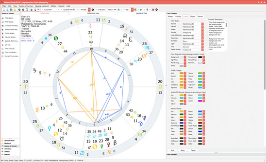
The above settings allow for modern type displays (for example the modern wheel) which excludes the bounds, decans, lunar mansions, etc, to use enlarged sign glyphs in the house wheel which will be the outermost wheel in this type of configuration. Also line thicknesses and styles such as dotted, dashed or combination thereof, font sizes and font families to be used for chart info, and planet listing styles (whether to show full listing, just the glyph or glyph and degree minus retrograde symbol using the Rx color instead). By changing the ColorStyle property of the House and Number wheels as shown below I was able to come up with a Modern Wheel type display:
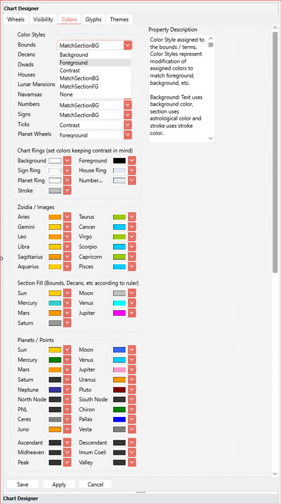
Notice that when ColorStyle is set to None for the Number Wheel and Foreground for the House Wheel, the stroke and fill colors are used instead which gives a bounded effect. ColorStyles allow for a flexible way of applying colors to planetary symbols in the chart. An explanation of where ColorStyles apply the colors for the 6 types is given for each wheel in the Property Description field as shown to the right in the above graphic. It updates when you select the wheel combobox because different wheel types have different definitions. PlanetWheels for instance don't color the background of a planet's area because it's unbounded unlike the bound wheel which gives a certain number of degrees to each bound.
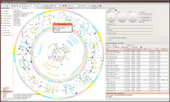
When working with GUI Styles in combination with the Chart Designer, it's possible to make a seamless display where the colors and style match both for the chart and the window appearance at the same time. There are literally thousands upon thousands of display possibilities here. By applying translucent colors in the Smoky Quartz Kamri GUI Style, I came up with this display for fixed stars...
Of the more particular settings are whether to list fixed stars and planets in the sign wheel, what types of bounds, decans, lunar mansions, and aspect styles to use. At this point, clicking Apply Wheel Configuration button will update the settings for display or you can click Cancel, or Refresh to start over. Reverting back to a previously defined display is as simple as double clicking on a Wheel Theme:
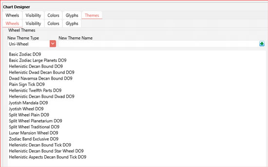
There are currently 53 different wheel themes already defined and the number that you can define is only limited by your hard drive space and imagination. The Wheels tab is the most complicated part of wheel design, but there are 3 more areas (Glyphs, Colors and Visibility) that follow similar principles. Each of these groups of settings has their own Theme tab so that you can save these settings as a group under a theme name. For instance if you are working with secondary progressions in wheel 2, you might not be interested in the position of the outer planets because they don't change much in a lifetime, so you can set the visibility for the 2nd wheel to show only Sun through Mars if you wish while selecting wheel one to save the visibility for wheel one as natal, then when setting the Visibility theme you can give it a name such as Secondary Progressions display.
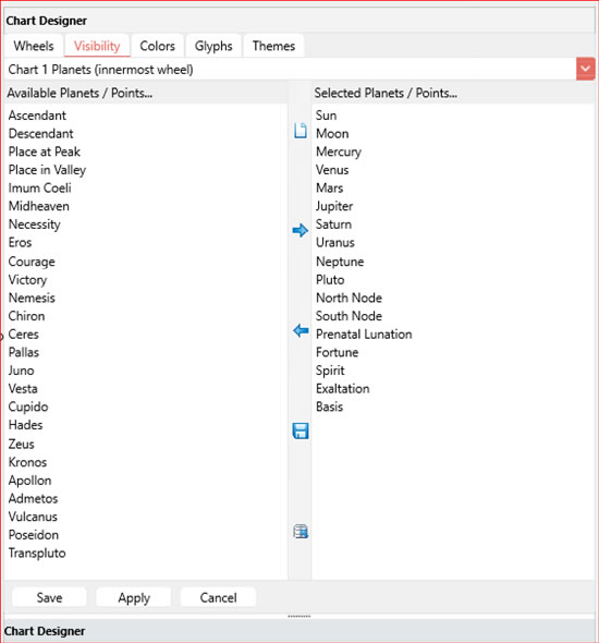
In the future when you want to do this display again you can just double click on that Visibility Theme and then go to autogenerated charts and set the secondary progressions to the 2nd autogenerated charts wheel and you're displaying that type whenever you double click on a time lord listing, Time Lords Graph or Graphic Ephemeris...
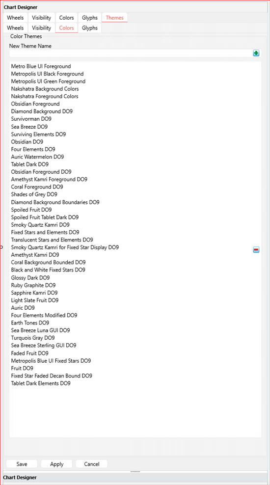
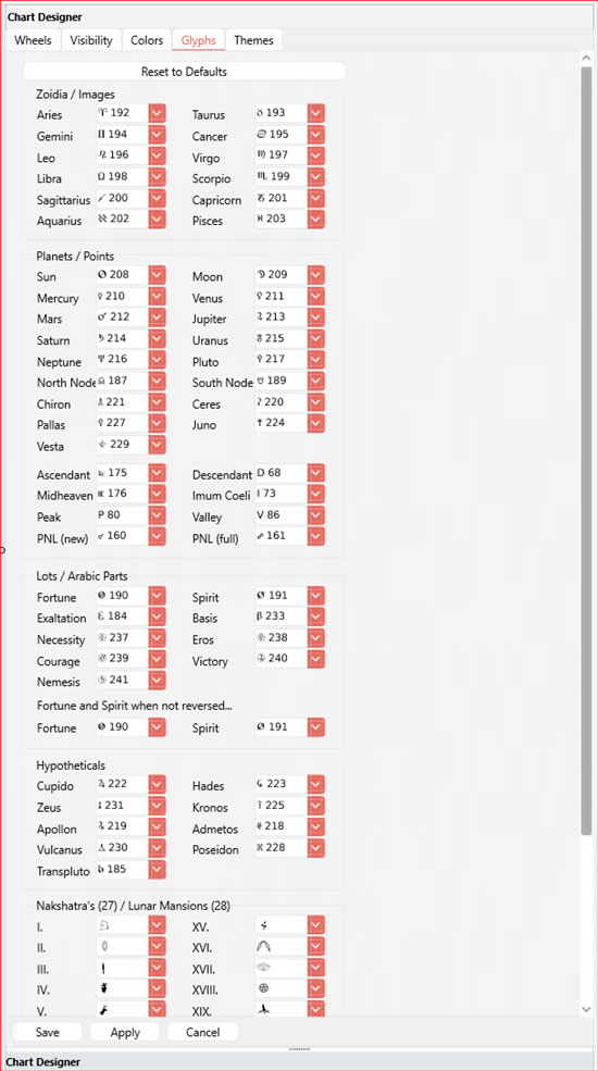
Between the visibility, colors and glyphs, there are a total of 61 themes pre defined (not including wheel themes). The Glyph themes are set up so that you can change what glyphs you want to use for various display objects. It is possible to change any display glyph in the program which probably makes this the most flexible program in the world in terms of chart display and configuration. It's also possible to get rid of themes you don't use by clicking on the theme so that it is highlighted and clicking the minus (-) button to the right.
The Colors Tab of the Chart Designer allows for setting any range of colors for your planet, point and sign glyphs which will be used in multiple areas of the program. Colors are a very important part of the GUI Styles and has its own Color Themes tab to group settings to match GUI Styles when appropriate so that the whole interface has a seamless appearance.
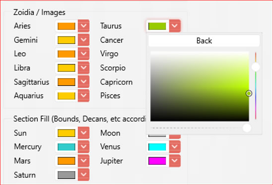
It's also possible to mix your own colors if a predefined set of displayed colors is not enough, simply click on the More button and the Colors Palette will be shown which will allow you to alter hue, saturation and even opacity.
Color Styles (shown 2nd picture from bottom) are one of the unique features of the Chart Designer which allow you to apply colors selectively to various areas of the chart displays. For instance, one might want to apply the color red to Mars when displaying that planet glyph in a planet wheel against the background color, but when showing the bounds of Mars, one might want to use the background color for the glyph itself and apply the color for Mars to the surrounding background. The color styles that are new with the XPF version of Delphic Oracle are MatchSectionBG and MatchSectionFG which means one wants to match the fill and stroke colors of the bounds, decans, planet wheels, etc to create an unbounded look. For this reason there is a separate Stroke color that is defined in the XPF version that doesn't exist in Timaeus Pro or Delphic Oracle WL.
Delphic Oracle WL and Timaeus Pro also have a similar setup, but the one from Delphic Oracle XPF is displayed here. Because of the advanced display capabilities of the XPF version a few of these options aren't available in Timaeus Pro or Delphic Oracle WL such as color opacity and certain color styles.
